Neshan 42
Different-II
Wit and Humor—Not a Laughing Matter: On British Graphic Design
Sara Jamshidi
Wit and humor can be considered as a simple and effective approach in communication. It is a manner seen in most cultures in order to form a connection between two subjects, which might seem unrelated at first, to add a delicate charm to the conversation. One of the cultures most famous for its distinctive humor is British culture. Wit and humor is, in an essence, one of the most significant and unique characteristics of British culture, but its unique way of humor is very different from other countries.
Wit, canniness, drollery, banter, wordplay, or jokes can be used in all situations throughout the day, but none of them are necessarily said to add humor to the conversation. The old joke goes, “English humor is no laughing matter.” In general, the Brits are known for their politeness and manners while having a distinctive sense of humor, and they value informal socialization. This is noticeable in every city and even small towns. Pubs are one of the most important gathering and socializing places in British culture and they can be found on almost every corner, from the rural villages in the Cotswolds to the most crowded neighborhoods in London. They are also some of the best places to learn about this vivid culture and its one-of-a-kind wittiness.
 Logotype, FedEx Company, 1994
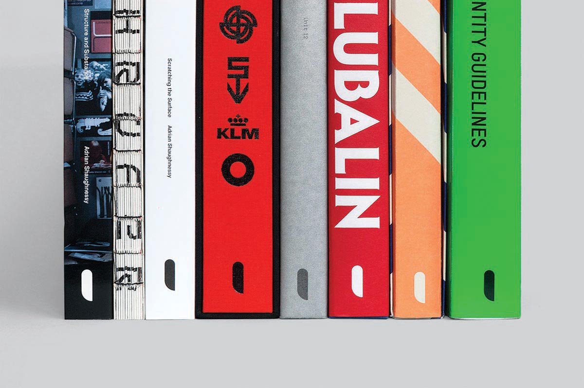 Logo, Unit Editions, images courtesy of Unit Editions
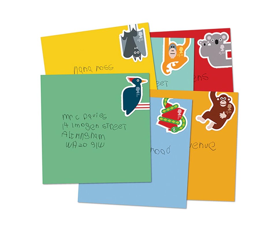 A set of animal stamps designed by Osborne Ross
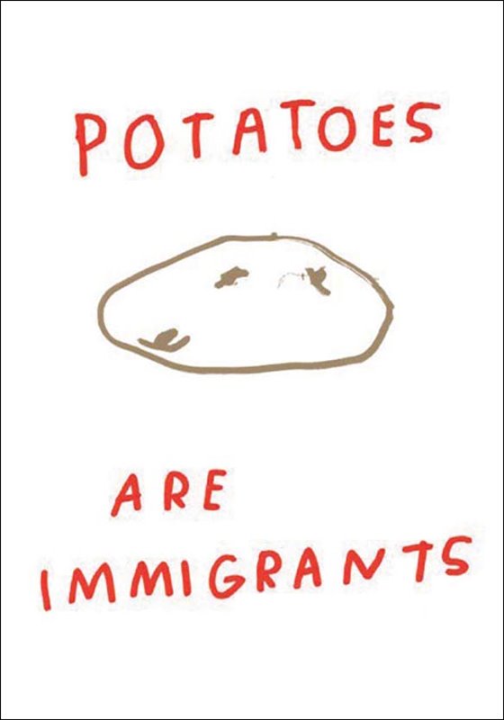 Potatoes Are Immigrants T-shirts، designed by Rosalie and Mia
One of the shared aspects of British humor, which distinguishes it from some other cultures’ humor is that they don’t take themselves too seriously. It is to an extent that most of their jokes and puns are directed at one’s own troubles and shortcomings, or they refer to the neighborhood or towns that they come from. At the same time British sense of humor isn’t only known for its jokes and wit, but also for the delivery, making it unique. For instance, the English slip their jokes in discretely and the person they are talking to may not even notice it until after—especially if they are foreigners. This is what people call a ‘dry sense of humor.’ Not many people absorb or even realize the humor, even those who have advanced knowledge of English. This in itself is a topic of most jokes—those not getting it or being frustrated about the situation. Similar to verbal and written communication, wit and humor is evident in British graphic design.
Wit and humor is a simple, yet impactful approach and solution for communication in graphic design. Coincidentally, it is not very different from verbal humor. The designer’s understanding of the cultural and linguistic context of the work is one of the most important factors in making a successful impact in a design project. It’s crucial that the witty element leaves an impression on the audience within a few seconds. Humor used in visual communication is different from verbal communication because the latter gives the speakers a chance to explain themselves, if needed. In this situation, the joke loses its impact, so to avoid embarrassment, it may be best for the speaker to leave the joke be and pretend it never happened. Wit, if used properly, has a long-lasting impression on the viewer, but if, for any reason, it doesn’t communicate correctly, it alienates the audience and makes him/her feel excluded.
There are numerous examples of successful humor used in graphic design. The book, A Smile in the Mind, has attracted many designers since its first publishing in 1996, and it is one of the most thorough references of using wit in graphic design. Throughout the book, there are numerous example of humorous advertising, commercial graphics, branding, logos, and product designs from various countries. One of the most famous examples is the FedEx logo, designed in 1994 by Lindon Leader. A right-pointing arrow is formed through the negative space between the “E” and “x” letterforms. Another, more recent example is the logo for Unit Editions designed by Tony Brook and Spin in 2009. As a matter of fact, the initial idea of starting Unit Editions was established during an interview that Adrian Shaughnessy had with Tony Brook at a pub in East London. Unit Edition’s logo brilliantly uses wit and cleverness to communicate the letterform “U” by only showing the counterpart of the character. Both examples display a gentle use of wit in graphic design.
Additionally, graphic design is not limited to communicating with a consumer and transferring a particular message. It’s also about providing subject clarity and enriching a topic of a project. A Smile in the Mind covers the subject of wit in design with project examples from traditional graphic design and commercial arts. The work of this selected group of designers directly communicates with various cultures and many designers use humor as their tool to successfully get their message across.
The success of using wit in graphic design directly relates to the culture of a country or region. Humor does not necessarily translate equally in other countries even if they share the language. For instance, British humor in a certain project may not be obvious to an American as it is intended for a Briton, and though they both speak English, they have cultural differences. For instance, the screenprint design, Potatoes are Immigrants, seen Keep it Complex—Make it Clear, is an example of using something that’s rooted in Britain’s culture but may not seem relatable at first to other English speaking countries. Keep it Complex—Make it Clear is a campaign and collaborative organization that has been initiated by various people including graphic designers in London, among whom are Royal College of Art graduates. This group provides tools and solutions for confronting and acting against complex issues that affect people from various backgrounds. They incorporate art within their ideas to help their audiences have a meaningful discussion about socio-political issues with others they wouldn’t normally talk to. Keep it Complex—Make it Clear clearly conveys its message and its contributors’ points without diminishing them and uses their ideas to confront political issues. The wit within the designs is a successful example of designers not only making creative work, but also shaping the context surrounding traditional projects. Their work benefits from a successful, humorous, and witty tone and directly points out aspects of British affairs, such as immigration and the country’s response to Brexit.
On the other hand, wit in graphic design can be globally understood and familiar for people regardless of their nationality or language. A prime example is the animal series postage stamps designed by Osborne Ross studio in London. A humble design, they send clear communication to the audience to increase their interest in writing letters. The stamps in this series show different animals and go beyond the conventional rectangular shapes of most postage stamps. More importantly, in all these stamps the animals’ hands or feet are meant to extend past the front of the envelope and wrap around the backside as if they were holding on to the letter.
Sara Jamshidi
is a research-led graphic designer currently living in London pursuing her Master’s degree at the Royal College of Art.
Raised in Tehran, she moved to the United States after receiving her BS in biology from Shahid Beheshti university. She studied Communication Design at University of Connecticut and Central Saint Martins in London. After graduation she joined Design Observer and Winterhouse studio, where she was senior designer and contributed as a writer.
Sara’s practice explores telling social and political narratives through communication design practice using various platforms and mediums
sara.jamshidi@network.rca.ac.uk
Design, Culture, and Us
Farshid Mesghali
> more
Iranian Contemporary Design
Excitement Management in the Years of Youth: A Review of the Works of MohammadReza Abdolali
Damoon Khanjanzadeh
> more
Project-I
The Type Chooses
Hirbod Lotfian
> more
Project-II
When Culture Occurs
Alireza Mostafazadeh Ebrahimi
> more
Design Today
Lev Manovich’s “Selfie City” Project
Emily Verba Fischer
> more
Reference-I
The Influence of Tadanori Yokoo in Europe
Mirko Ilic
> more
Reference-II
The Times of a Modernist: A Review on Burton Kramer’s Works
Majid Abbasi
> more
Archive-I
Vladimir Mayakovsky; The Herald of the New Era
Olga Severina
> more
Archive-II
Preserve, Activate Graphic Design: In French Institutions
Vanina Pinter
> more
Different-I
Sahara: Branding a Refugee Camp
Amir Berbić
> more
Memoriam
Memory of an Eclectic Modernist: Ivan Chermayeff
Steven Heller
> more
Overview-I
Graphic Design and Ethnic Languages in Iran
Mehdi Haghshenas
> more
Overview-II
Folk Culture and Graphic Design
Ali Bakhtiari
> more